Wednesday, July 17, 2024
markets are turning, BTC’s narrative, the US consumer narrative
“Human life is driven forward by its dim apprehension of notions too general for its existing language.” – Alfred North Whitehead ||
Hi everyone, I hope you’re all hanging in there! How come it isn’t Friday yet…
This may seem like a long newsletter today, but I assure you it’s mainly charts, an easy skim. (You’re welcome! 😋)
I hope you find Crypto is Macro Now useful or informative or even maybe just fun for the music links – if so, would you mind sharing it with your friends and colleagues? ❤
IN THIS NEWSLETTER:
Markets are turning
BTC’s narrative
The consumer narrative
If you’re not a subscriber to the premium daily, I hope you’ll consider becoming one! You’ll get unique content, interesting links and my eternal gratitude - and there’s a free trial!
WHAT I’M WATCHING:
Markets are turning
Here’s an astonishing statistic:
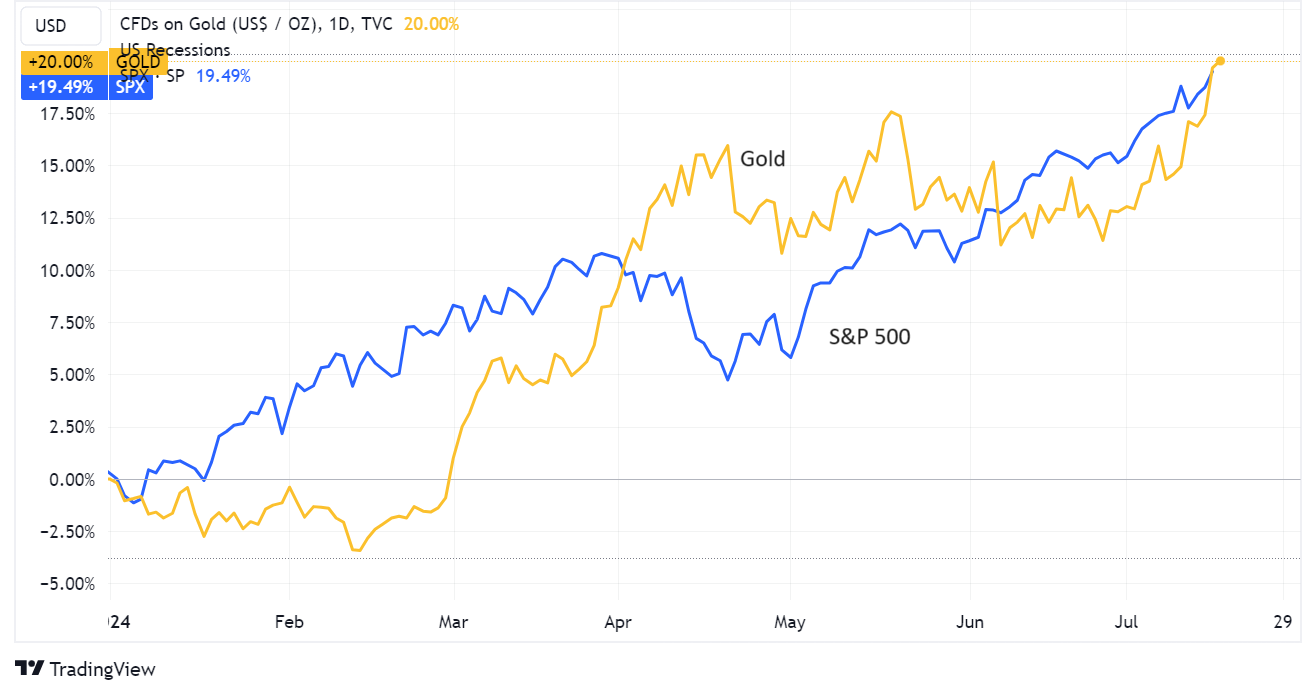
Year-to-date, the S&P 500 is up 19.4%. That’s good, for traditional assets.
But get this – gold is up even more. Year-to-date, the oldest investment asset of all is up 20.2%. “Safe havens” are even outperforming equities.
(chart via TradingView)
That is weird but not surprising, and suggests a strong shift away from “risk” is masked by tech stock performance.
Only that, too, is changing. Check out the relative performance over the past month of the S&P 500, which we know is at record tech stock dominance, and the equal-weighted S&P index (RSP).
(chart via TradingView)
Here’s a chart I shared a few days ago, showing just how extreme the current level of index concentration is:
(chart via @BiancoResearch)
And here’s a glimpse of how sharp the turn could be, given the amount of money that has flown into tech stocks over the past year:
(chart via @albertedwards99)
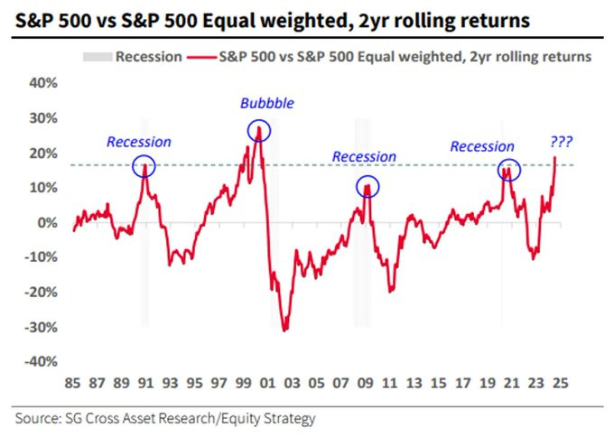
This chart from SocGen (via @dailychartbook) shows that a high S&P/equal weight ratio, such as that reached earlier this month, is usually one of those flashing signals.
(chart via @dailychartbook)
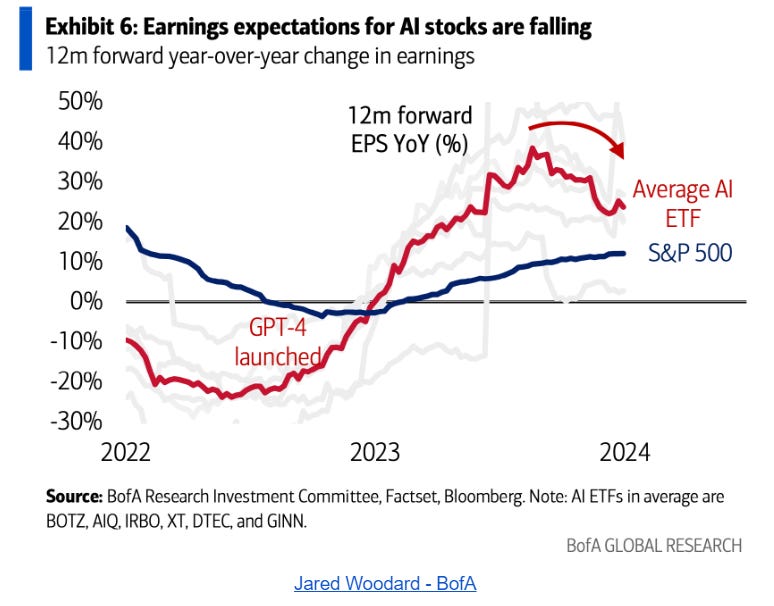
Oh, and look at this, it seems that analysts are finally coming to their senses regarding AI earnings impact expectations.
(chart by BofA, via Daily Chartbook)
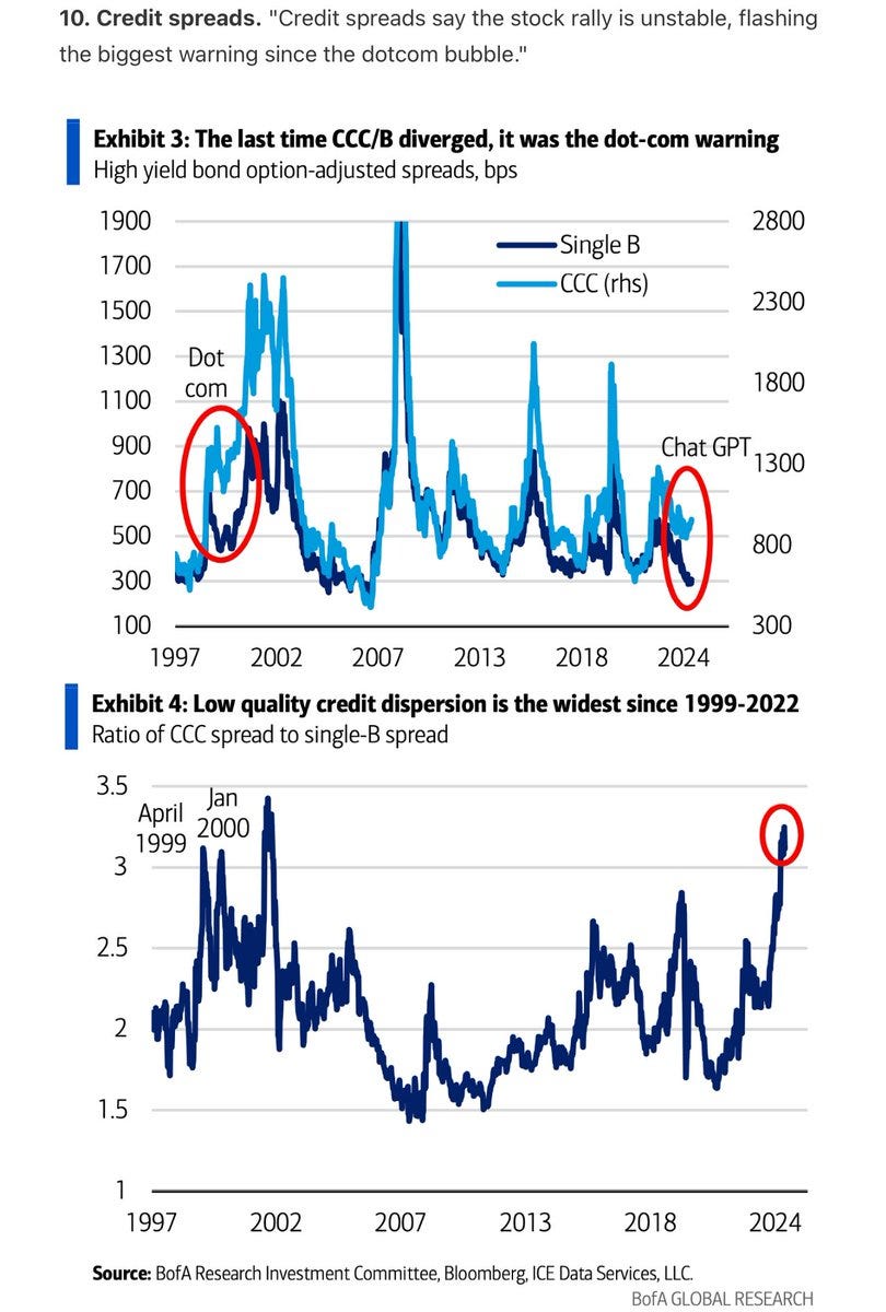
What’s more, the credit market is starting to signal that all is not well in the high-risk segment – the last time the spread between BBB and CCC bonds was this high was around the dot-com crash.
(chart by BofA, via @albertedwards99)
And high-yield debt indices, which have faithfully tracked the climb in equities over the past couple of years, are starting to peel away.


